


As I've shown in a previous post, I designed a bit of an app. I didn't feel I could design one without a website! I feel this is important as there are a few people who don't use smart phones and others may simply like to access the information on a wider screen. The website will also act as a base, linking all three together: website, app and printed pack. Customers can also download and print versions of the information such as the meal planner. It will also be where you can buy the starter
printed pack (my box of goodies). All three together will ensure that the initiative
targets a large audience.
Evaluating existing websites
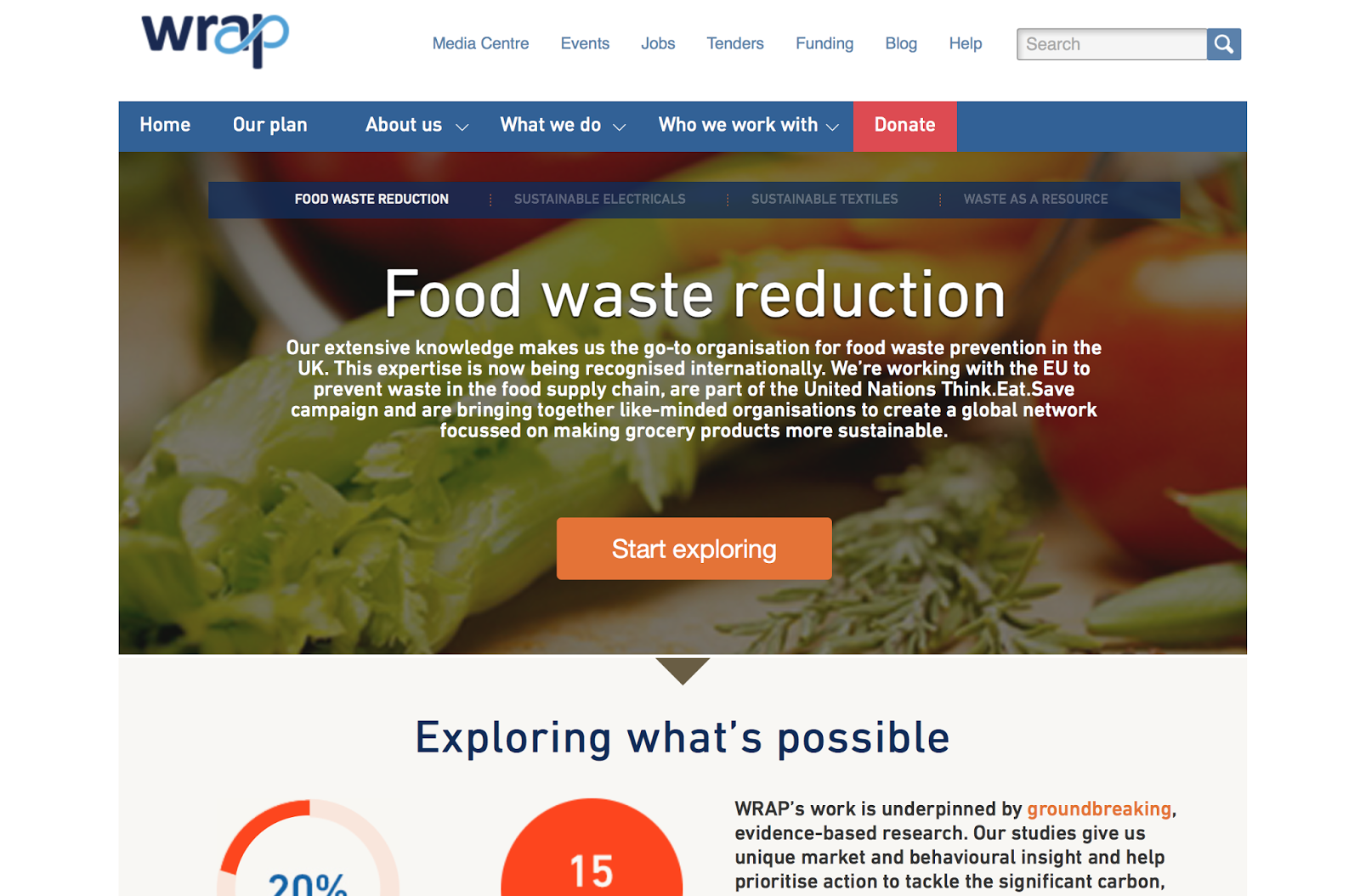
Wrap- I picked this website as it pops up a lot in my dissertation. When I looked at it I saw that it's so dull and boring. It's focus lies on the issues it discusses rather than it's appearance.
Love Food Hate Waste- This again is spoken about a lot within my dissertation and also has links with Wrap. This website is a lot more interesting and provides a lot of information. The website is fun to explore and navigate. I like the use of purple against the green, however there's a lot of photos and little illustrative elements.
Graze- This isn't to do with food waste but it is based around a food box/pack that is sent to homes (similar concept to mine). Because of this it felt appropriate. The website is interesting to look at and has added elements of fun fonts and illustration. The photography is fun and playful too. The website supplies info on the box and allows you to buy it online, much like I want mine too.
Sourcedbox- This is very similar concept to Graze. Much like Graze's website, it acts as a place to buy the box. The website is very attractive in terms of colour and layout but quite simple. It lacks illustrations as it may not be appropriate, however it does have some really playful photography.

Above you can see my website!! Based on my research and the illustrations I have already made, I produce this. I'm happy with how it looks, but would have liked to work on it more if I had the time. I just wanted to give an idea of how it would look. The colours and imagrey work well with the rest of my work, making a cohesive project. I made my own mac screen rather than taking one off the internet as mock, as I thought it looked more professional and worked better with the graphics on screen.
Overall, I'm really pleased with how it looks!
No comments:
Post a Comment