Thursday, 14 January 2016

Summative Statement

Food waste is considered to be one of the most prevalent concerns of today’s society. Through research informing both my written and practical responses, it has become apparent that although the issue needs addressing by all those involved at the various points of the chain, (consumers, supermarkets, small retailers, the government, farmers) the responsibly lies primarily with consumer.

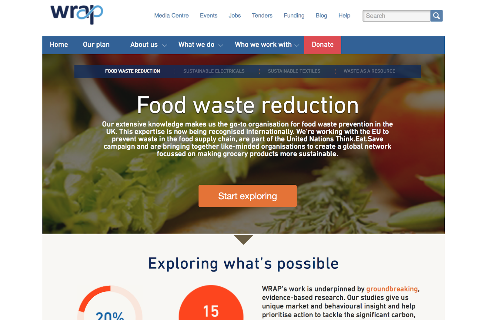
My dissertation partially focuses upon how the issue can be tackled locally. Through primary research it evident that consumers responded more favorably to activity based learning with a visual appeal, containing useful practical items such as magnets and shopping lists. Forfatterne (2014) suggests that learning and education are effective ways to instill the responsibility to change behaviour and habits in people. With UK households wasting a huge 6.7 million tonnes of food each year, it became clear to me that the solution needs to start at home and then an informative, educational pack would be an effective format.

As a response to my dissertation I have produced an information pack with the intention that it be sent to home owners that wish to learn about and reduce their food waste. With the aim being that we find a long-term solution, I felt it to be important that my pack/illustrations be family appropriate and child friendly. By educating children at a young age, they learn good habits to hopefully make a better future. This initiative ensures future generations adopt a healthier attitude towards food and consider the detrimental impacts of waste.

The pack illustrates the different problems surrounding food waste and solutions to the issue. This includes education on misshapen food, storage tips and ways in which we can use up soft food. Consumers have the ability to make major changes through simple decisions in their daily lives. The information pack I have produced will encourage these simple acts through the means of a shopping list and meal planner in the hope of re-claiming the act of meal planning within the weekly shop.

In theory, the pack acts as a starter guide to those in wish to learn. In addition to this, I have proposed the ‘Taste it, don’t waste it’ app, to widen the platforms in which the information can be accessed. The app also aims to target an audience aged 18-30 (including students), as this issue is one that needs addressing by all ages and a mobile application proves popular among a younger generation. The app also hopes to promote the idea of a local solution by proposing a community forum through the means of the postcode and social media. The idea being that a community will be brought together to share tips and learn of any local initiatives, such as food banks in the area.


As I have taken an approach which conveys the message to a variety of ages and levels of interest via different formats, it is hoped that I have given the project the widest reach possible to raise awareness to the broadest range of people.

Presentation Boards

I'm really pleased with the work that I have produced for this module. I think it's some of my best work. In terms of practical I think I have produce a visually strong, cohesive package of work. Although there are some minor errors along with the logo mistake, overall I'm really proud of the work I have produced. Looking back on the work I produce for CoP2 last year, I think I see an improvement and I've really pushed myself.

Writing a dissertation was something I've been worried about doing for years. Writing is certainly not a strong point of mine, but I really put my all in to it and almost enjoyed what I was writing about. I still can't believe I actually wrote it. I think I chose my topic well.

 I have really thrown myself into this project and the research and I think it comes through in both the written and practical. I don't think the research is something I've been that good at in the past, but with it being such an important part of this module, I ensured that I gathered a lot of research. Secondary research was easily accessible as this is currently a hot topic in the media. Hugh Fearnely-Whitingstall presented a food waste programme right in the middle of my research, along with Country File doing a segment too. Adam Smith, Co-Founder of the Real Junk Food Project also did a talk at the university, and with first ever cafe being in Leeds - it was perfect. This is not to say that I didn't do anything, as I made efforts to go and interview people - even places where I didn't feel comfortable (TRJFP). Though I do regret not talking to more people. I feel as though the research comes through in my work and that the synthesis is strong between the written and practical. Both of these I feel answered my dissertation question, with the practical also finding a possible solution.

Whatever my grade is going to be, I am truly proud of myself and the work I have produced.

Visual and Conceptual Development

I have selected pieces of my sketchbook and development that helped informed to practical response. These are some of the key moments. During this module I feel that I have used my sketchbook well. In previous years, I have neglected the role of my sketchbook. However, this year I have used it as a tool for thinking and development. I loosened up my drawings and just played with image making. As half of the module is written, I felt it important to keep drawing and being creative so I didn't get hung up on my dissertation. When producing my final illustrations I kept referring back to my sketchbook and allowed them to inform my work. Although my finished pieces were purely digital, I still see a link between them and my original sketchbook sketches. However, looking back, I do feel it is a shame that I didn't produce finished work by hand too.

Wednesday, 13 January 2016

I have a problem...


If you haven't noticed already, I've made a big error. To explain, when I designed the logo the original design said 'Taste It Not Waste It' but after asking other opinions, I decided to change it to 'Don't' as people thought it sounded better. I took the new design and printed it across various products I have designed. However, I didn't save the changes I made on the original logo document, so every time I went to put it on more products I was putting the old logo on! 

*facepalm*

I've realised now that some of my products have the old logo and some have the new. How stupid am I?? Answer: Very. I'm so upset! It's really bugging me and I'm kicking myself because of it. I was so pleased with what I had done, but now I can't unsee the error. It's too late to correct it as well.
I just think it now looks unprofessional as now inconsistent. 
I've let myself down.


3rd and Final Print day!


Up until now I've had my magnets just in a plastic wallet, so I thought it needed some form of packaging at the top, similar to other products out there. I came up with a quick design yesterday ready for my print slot today and I'm so pleased with the design. My design is obviously based around a carrot and I thought it would look funny/cute if I could get the leaf to stick up of the packaging. By cutting part of it out and bending it forward I was able to achieve this. I think it looks great!


Obviously something always goes wrong so it's not perfect. I got the measurements slightly wrong on  the folding machine so folding is a little messy. Also, the card is too small for the plastic wallet, how annoying!! I should have double checked, I'm so annoyed at myself! Thirdly, the cutting out isn't very neat either. But I'll learn from these mistakes for future projects.


Other prints!!

I also printed my 'watch your waste line' card and my presentation board which look great!!
As well as this, I reprinted my 'Top tips for foody tricks' book as some spelling mistakes were found in the final crit.


Tuesday, 12 January 2016

Context - Emailing People

After I submitted my CoP last year I was encouraged to contact organisations that might be interested in what I had done. I received some really great feedback, and even the RSPB discussed the possibly of my pack at their meeting. Although that didn't come to anything, that work has no led me to be working with Natural England and if all goes well they might actually make my pack properly. This has shown me that although contacting people is scary, it's worth a try so I'm going to do the same with this years work.

I've started making a list of people I could contact:

  • Love Food Hate Waste
  • Wrap
  • Supermarkets 
  • the 3000 Club
  • Campus Kitchens
  • Food Recovery Network
  • Feed Back
  • Fusions
  • Food Waste Alliance
  • Think Eat Save
  • Boulder Food Rescue


I'm still looking so hopefully I'll find some more. As this module is in on Thursday, this task will be taken on to PPP.

Competition


Weeks ago, when I was still deciding what to make practically, I was told about this competition. I decided to ignore it as I thought it might restrict me and use it as an extended practice brief instead. However, I ended up not choosing it as an extended practice brief, and after reading it again, I think the work that I've produced would be appropriate to submit for the competition.

Monday, 11 January 2016

Photographs

Last year I asked one of the photography students to photographs my work for me and she did such a good job, I asked her again this year. We did a similar shoot as my cop2 as I think it worked well last year. I also asked if she could take some photos of the carrot magnets on the fridge to show them in context which also look good. These will be great to put on my boards. I think they look a lot more professional than if I were to take them.

Sunday, 10 January 2016

An extra little something!


Once I got my pack printed and put together I felt like it lacked information. You open it and have to assume that it's about food waste because it doesn't say. I had a look at some existing packs (not for food waste) and some have a little welcome message. I really liked this idea so made one myself!

The idea is that it's the first thing you see when you open the pack, so after opening the box but before the tracing paper. I think it's such a lovely idea that helps gives it a bit more context and information for the audience. People love opening presents and getting little gifts so I wanted to make it a fun experience that people enjoy opening.

I kept the design really simple and I think that's appropriate. There's a lot of colour and pattern going on inside the box so I think it's nice that this is different. I'm really happy with the layout and simplicity of it. If I added anything else it would be unnecessary and ruin it's purpose.

(yes I see the typo and it's now fixed)

Watch your waste line!


I have another print slot on Wednesday morning to print my boards and I thought as I have time, I could make a few extra things to go in my box. 'Watch your waste line' was a nice pun/tag line that I wanted to use but ran out of time to do for the last print slot. I kept this design quite simple and I wanted it to look similar to the 'Don't bin it, blend it' design. 

I produced this design quite quickly as wasn't much to draw, so it doesn't look too exciting. I chose spaghetti bolognese as it's something that a lot of people make too much of (speaking from experience). I find pasta a really hard thing to judge in terms of portion size, and I think others do too. I also chose this, as bolognese is something you can easily freeze if you make too much!

I think my design for this info card is simple and says what it needs to say. It doesn't need any other imagery and I think it communicates more with it just being two plates of food. I think the composition works well also with a good balance of text and image.

This weeks plan


Got a busy last few days before hand in! AHHHHH! I'm mostly on track it's just a few things I need to do on my blog.

Website!


As I've shown in a previous post, I designed a bit of an app. I didn't feel I could design one without a website! I feel this is important as there are a few people who don't use smart phones and others may simply like to access the information on a wider screen. The website will also act as a base, linking all three together: website, app and printed pack. Customers can also download and print versions of the information such as the meal planner. It will also be where you can buy the starter 
printed pack (my box of goodies). All three together will ensure that the initiative 
targets a large audience.

Evaluating existing websites

Wrap- I picked this website as it pops up a lot in my dissertation. When I looked at it I saw that it's so dull and boring. It's focus lies on the issues it discusses rather than it's appearance.

Love Food Hate Waste- This again is spoken about a lot within my dissertation and also has links with Wrap. This website is a lot more interesting and provides a lot of information. The website is fun to explore and navigate. I like the use of purple against the green, however there's a lot of photos and little illustrative elements.

Graze- This isn't to do with food waste but it is based around a food box/pack that is sent to homes (similar concept to mine). Because of this it felt appropriate. The website is interesting to look at and has added elements of fun fonts and illustration. The photography is fun and playful too. The website supplies info on the box and allows you to buy it online, much like I want mine too.

Sourcedbox- This is very similar concept to Graze. Much like Graze's website, it acts as a place to buy the box. The website is very attractive in terms of colour and layout but quite simple. It lacks illustrations as it may not be appropriate, however it does have some really playful photography.


Above you can see my website!! Based on my research and the illustrations I have already made, I produce this. I'm happy with how it looks, but would have liked to work on it more if I had the time. I just wanted to give an idea of how it would look. The colours and imagrey work well with the rest of my work, making a cohesive project. I made my own mac screen rather than taking one off the internet as mock, as I thought it looked more professional and worked better with the graphics on screen.

Overall, I'm really pleased with how it looks!


Friday, 8 January 2016

Final Crit


Today was our final crit and it went really well. When I printed my work yesterday I thought it all looked a little dull in terms of colour and they weren't very exciting. However, seeing it all laid out and having things standing in the box, I thought it is actually a good body of work and I should be proud. This was strengthened by the lovely feedback I received and being told that the use of duller colours work well against the bright packaging. 


 I received some great feedback along with some suggestions on what to work on. The crit was very encouraging and a great confidence booster. What I mostly have to work on a few things on my blog and evaluate the decisions I've made. I talk about the decisions I've made but not why.


Thursday, 7 January 2016

Last Tutorial


Ok after scanning it in I've realised you can't see the text. Clever me! 

I had my last tutorial today and it went well. We mostly discussed the format of the dissertation ready for submission. I need to add the word count on the cover page and have all the titles the same font/size etc so it is consistent. I should keep referring back to the information on estudio about formatting it so I have everything set to guidelines. 

In terms of practical, I've got to print what I'm confident with and if there's anything I'm unsure about, I should print it on cheap paper and wait until I have peer feedback on it.

Everything's coming together now.

Supergluing


In a previous post I mentioned that I wanted to glue the sides together on my box so that it holds it box form when opened instead of collapsing flat. I've already tried double sided sticky tape on a previous box and it wasn't strong enough. I also didn't think pritt stick or pva glue would be strong enough, but luckily my lovely flat mate came to the rescue with superglue!! Here's a very attractive photo of us carefully putting it together. 


And here's my finished box! I'm really glad I did this, it's just an extra little thing that gives it a better finish. It now holds its box form instead on flattening back to it's net shape. Now the work that goes inside it won't move around.


Wednesday, 6 January 2016

Meal Planner


I've just finished illustrating the meal planner. As I've found out during my research and as my dissertation states, people are buying on impulse rather than planning their meals. This in turn results in wasted food. Because of this, I felt it important to produce a meal planner, with the aim that people will put it up in their kitchen and plan their meals. I had already produced my design for the shopping list, so I thought it would work well if I used the same imagery for the meal planner too.
 This helps the two work as a set.


Info Cards- Development


During my last tutorial it suggested that I look at alternative formats, as my illustrations looked too cluttered in the composition above. Much like my other imagery, I thought that that images worked best by themselves. I didn't want to just make loads of books so I thought about just making info cards. That way I could play around with the illustrations so they're not just plonked on the page.


This is what I came up with below. Because of the new format, I was able to produce some more illustrations of some extra food. If I had chosen to do another book, I would have been restricted as you have to work in 4s. I still really liked the title, and wanted to include it somewhere. I decided to add the title on to the back of all the cards which in turn helped them work as a set. By adding the imagery that I've previously used for the shopping list design, I was able to help the 'shopping list' work with the other imagery more, as I felt it didn't before.

Overall, I'm pleased with these outcomes, they work much better within these frames than they did in my previous design. It also helps with the interactive element of the pack, making it more children appropriate. The designs as a whole look a lot more interesting and attractive. I like that each card is a little different, and that I didn't have to stick to a similar layout for all of them.


Monday, 4 January 2016

Magnets!


My magnetic sheet arrived today, so I finally made my carrot magnets. I'm so happy with them, they're so cute! I was worried that they'd be a bit small, but after putting them on the fridge I'd say they don't need to be any bigger. As magnets I think they work well and I'm pleased I chose to illustrate them as wonky carrots. I think this idea particularly works well with it being aimed at families with children. Kids would find the ideas of odd shaped carrots amusing.

Foody Tips


It was advised that I should come up with an alternative format/composition for my illustrations as they look cramped and the images would work well as separate illustrations. I took this on board and made a book like I did with the other illustrations. I made this one a little different by making it square and chose to have the images placed in the centre of the page by themselves. This worked well and because of this, it's my favourite book of the two.

Sunday, 3 January 2016

This weeks timetable


First week back after christmas break. I've been in Austria for a week so I need to make sure I'm organised the next couple of weeks. Thought I'd make a plan.