Wednesday, 6 November 2013

Study Task 4


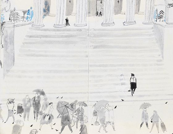
For this task I chose to analysis Laura Carlin’s ‘inside a rape trial. The illustration shows a lot of meaning and emotion through the detonations.  The signifiers of the image are the umbrella and the steps and the bottom of some pillars. This signifies the image of a rainy day and a really large extravagant building.
The illustration’s main focal point is the large steps in the centre. With them leading towards what looks like is going to be a large, posh building, it makes it feel quite intimidating and connotes the descent in to the woman’s loneliness.  The large pillars at the top of the steps helps reinforce this; although you can’t see all of the pillars you get an idea of how big they are from the small man stood next to it. The building looks old and grand and what you’d imagine a court to look like. The connotations of a court are negative and imposing.
Near the bottom of the steps is a woman painted in black. The emptiness of the steps connotes that she’s lonely. She is the darkest part of the illustration, singling her out from the rest of the image. This connotes how she must be feeling; different and alone from everyone else. The rest of the crowd of people at the bottom are all grey like the rest of the illustration. This connotes that they all blend in with the rest of the world and she feels different to everyone else and possibly feels like she will stick out and everyone will judge her.
However the people at the bottom seems to ignoring her presence, possibly to connotes that they don’t notice her and she isn't important or perhaps to show she has nothing to worry about because she’s normal just like everyone else. The illustration denotes the woman walking in to a wall of people. This connotes her coming back in to society and leaving the court that was once separated by the large steps in between.
The colours used a are dull and grey, connoting sadness. When you look at this illustration your mood is affected and you feel sad and sorry for the woman in black. As well as this, there is a small amount of blue within the piece, which is connoting dull unhappiness. The use of media was important with the piece; the washed ink again connotes sadness and a horrible rainy day. The people at the bottom of the illustration are holding umbrellas, connoting that it’s raining, adding o the misery of the piece.  As a whole it shows a really horrible day.

The illustration detonates shapes that resemble birds. These have also been drawn in a black like the lonely woman. Perhaps it connotes that she feels disgusting like a pigeon.


Fine art and Illustration


NC Wyeth is known for being one of America's most successful illustrators, and yet his work is similar that work displayed in a fine art gallery.  However many of his pieces were commissioned by people like Coca Cola and Lucky Strike so I think it's a good example for the term 'illustration is the beginning of selling out'.
Whats's interestign though is that Wyeth said "Painting and illustration cannot be mixed—one cannot merge from one into the other.".   Gopnik, Adam (November 15, 1998). ""Pictures Great," His Publisher Told Him, review of N.C. Wyeth by David Michaelis". New York Times. Retrieved 2007-02-18.

Tuesday, 15 October 2013

Image Analysis Exercise

Compare and contrast The Uncle Sam Range (1876) with Savile Lumley’s wartime poster (1915)

The fonts used on the posters are different from each other because of the purpose behind the posters. The poster done in 1915 produced by Savile Lumley using italics to show the text is speech and the people in the poster and in conversation. The word ‘you in underlines and bold, standing out from the rest of the sentence. This is to engage the audience, and to show it’s aimed directly at the viewer. This is typical of a British propaganda poster and emphasises the images showing the father looking directly at the audience.

This differs from The Uncle Sam Range (1876) advertising image; the image uses bold capitals. This feels very typical of America, as they want to show they a bigger and better than anywhere else. The bold text is also used to stand out against the busy illustration behind it. The image itself is very patriotic suggesting that if you were to buy the cooker it’s advertising then you’ll be doing your duty towards your country.  It looks like America are trying to establish itself in the world; the list of counties and meals listed on the roll of paper shows they’re trying to suggest they can feed the world, or that this cooker can cook anything for anyone.

The British poster is also very patriotic to England because of its use of colours and subtle clues like the boy on the floor playing with the Queen’s guards and the roses on the curtains. Both are typically British.

Most posters are aimed at the men in the family. The American one because its suggesting that if you were to buy to cooker then you’ll be long after and pervading for your family. You’ll be the Uncle Sam of your own family.
The British poster is aimed at middle class. You can tell by the posh clothes and furniture. During the Great War men weren’t made to join the army, they relied on volunteers. Most working class men would of joined so this poster makes the upper class people think that they are no different to them and should also join.

The British poster is very obviously aimed at the father of the family.
The children in the poster ask ‘daddy, what did you do in the Great War?’ This uses children to guilt trip the men in the family to join up and help with the great world war. The poster uses the little girl as a metaphor because it’s really the government asking the men to join the army. The poster is set in the future, implying that Britain will have victory, to persuade that if they join it’ll be for the better good and they will be seen as a hero. Both posters promise a better life and trade off the idea of national identity and making your country proud.

Wednesday, 9 October 2013

I was trying to think of an advert recently that effected me and then I remembered the one for the new Thompson Dreamliner. I really liked the way they projected old family holiday movies on to the side of the plane. It made me think of my own memories and made me feel emotional.


I just got a book called 'Illustrated Next' and in it I've found quite a few pieces that I dislike. the image below is an example. I like more traditional illustration and when i see something like this i dont undestand why it is good.


New Girl is one of my favourite programmes I think it's really fun and quirky. It's not serious like most things you see one on tv these days. I found an image from the opening sequence. i love the use of design and props.


I got this book during this summer after seeing a book simular last year: 'An illustrated life' by the same auther. I love looking at illustrators sketchbooks and seeing how they work. i find it really inpiring.
i really like the graphic novels for 'The Walking Dead' but particular the first one illustrated by Tony Moore. I find them really strong and bold. I was never really interested in comics until I saw this one  and saw that it doesn't just have to be cartoons but can look realistic.